5-room HDB Resale Flat @ 809 Woodlands Street 81
Designed by Brandon Lin

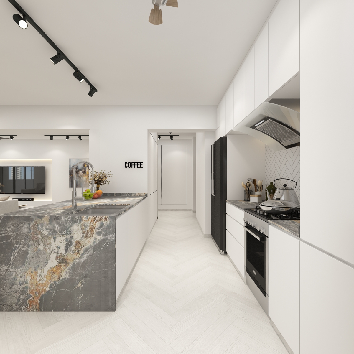
Elegantly clad in modern Scandinavian, this spacious 5-room residence expresses itself as the epitome of comfortable living. The beautiful dark wooden tones found bracing the kitchen island fuses impeccably with the softer, muted tones of the accent wall and the herringbone flooring.
This distinct style focuses on simple form and function, as can be seen by the humble, minimalist profiles of the Industrial light fixtures and abstract wall art. It most certainly is a blessing to come home to such an ambience, after a long and productive day at work.

As we advance further into the abode, the emphasis on intricate detailing starts to set in. On the kitchen island, a countertop with an artisanal marble finish supports the modern-minimalist concept of the space, providing an extra touch of finesse to the luxurious ambience. With the predominantly white colour palette of the kitchen, the marble finish on the kitchen island naturally stands out and provides a beautiful visual contrast to the space.

The concept of purity is vividly expressed in the living area of this resounding project. A clean interior rid of distraction injects tranquillity into the residence, enabling it to be a timeless piece which in turns introduces the concept of perfect simplicity, in a minimalist yet stirring format. The aptly selected muted colour palette in the living area is a firm base for building the imagery of comfort, minimalism and tranquillity.
With the incorporation of pops of colour, a satisfying and visually well-balanced living area is achieved. This can be seen in the deliberate mix of coloured pillows and abstract wall art. Furthermore, bits and pieces of intricately placed greenery further enhance the effects of calmness, brought about by the integration of nature in this design.

Right off the bat, an arsenal of luxurious elements is effectively applied in walk-in wardrobe. The use of gold trims on the beautifully curated closets is not as straightforward as it seems, as a careful selection process is undertaken, to determine the most suitable colour palette for every individual surface, especially with a colour as attention-grabbing as this.
On that note, the colours chosen in this space provide an undeniable sense of luxury and grandeur. Without a doubt, this walk-in wardrobe was catered to serve the purpose of exuding royalty, which makes perfect sense for a space that serves a single essential function.

The elephant in the room is most certainly the revolving rectilinear full-length mirror. This beautiful curation also serves as a talking point for when guests are over. It’s not every day that you get to see a fully functional and extremely aesthetic feature such as this.

Intricate detailing plays a vital role in a well-designed interior space. In this case, the artisanal pendant lights portray an essential, yet often overlooked principle of design, visual contrast. The chunky, metallic frames of the pendant lights successfully bring the dining area to the foreground, highlighting the space in a simple yet effective way.
The focus on materials and detailing is extremely apparent, especially in this dining area. A unique character is injected into the space, whereby a sense of quirkiness can be anticipated, yet maintaining a luxurious ambience in the overall design – truly a match made in heaven.

As we move further into the kitchen area, the vertical panels running on the surface of this wall helps to capture the attention of users, hence providing a seamless transition from the living area toward the kitchen area. What’s even better is that this slatted wall could serve as a handy clean background for taking pictures.

The washroom is decked in elements that elevate the comfortability of this particular space. In essence, the grey accents of the wall panels give the space a specific lustre and sense of warmth. Furthermore, the wall-mounted sink is made to replicate a ‘floating’ element, which effectively reduces clutter and visually expands space.
In this washroom, the same language is spoken and carried over from the previous one. The main highlight of both bathrooms is most certainly the intricate design found on the sink. It demands to stand out in the space, with its ‘floating’ element and vintage patterns. The contrast in materiality between the sink and the rest of the bathroom is seamless and well-arranged, enabling the transition to seem effortless and intentional.

An emphasis is placed on the theme of minimalism in residence. Albeit it being barely noticeable, the placement and incorporation of potted plants, beautiful wall art and standalone features within the space, is exactly what makes this project simply perfect and perfectly simple!
Want to find out more about your renovation cost? Contact us for non-obligation quotation


